Fall Color Palettes 2026: 40 Fall Outfit Ideas You’ll Love
Looking for the best Fall Color Palettes 2026? Explore 10 gorgeous autumn color palettes paired with 40 stylish outfit ideas. Get inspired...
In This Guide
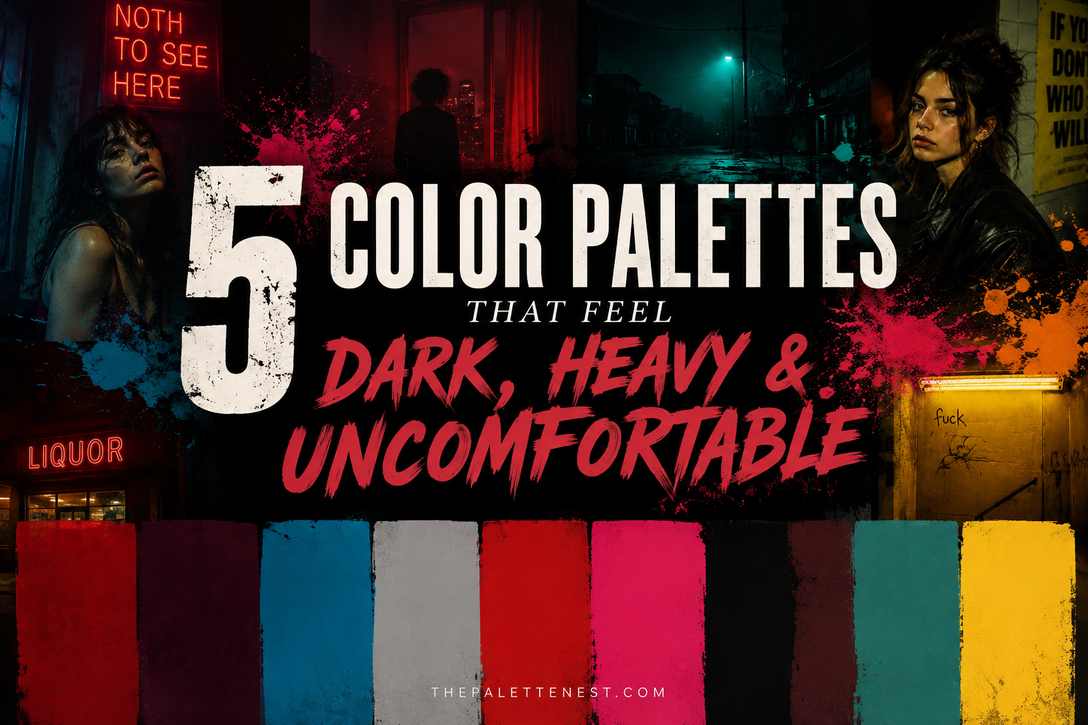
Not every beautiful color palette feels comforting. Explore five unexpected combinations that create dark, unsettling moods—and discover the psychology behind the emotions they evoke.
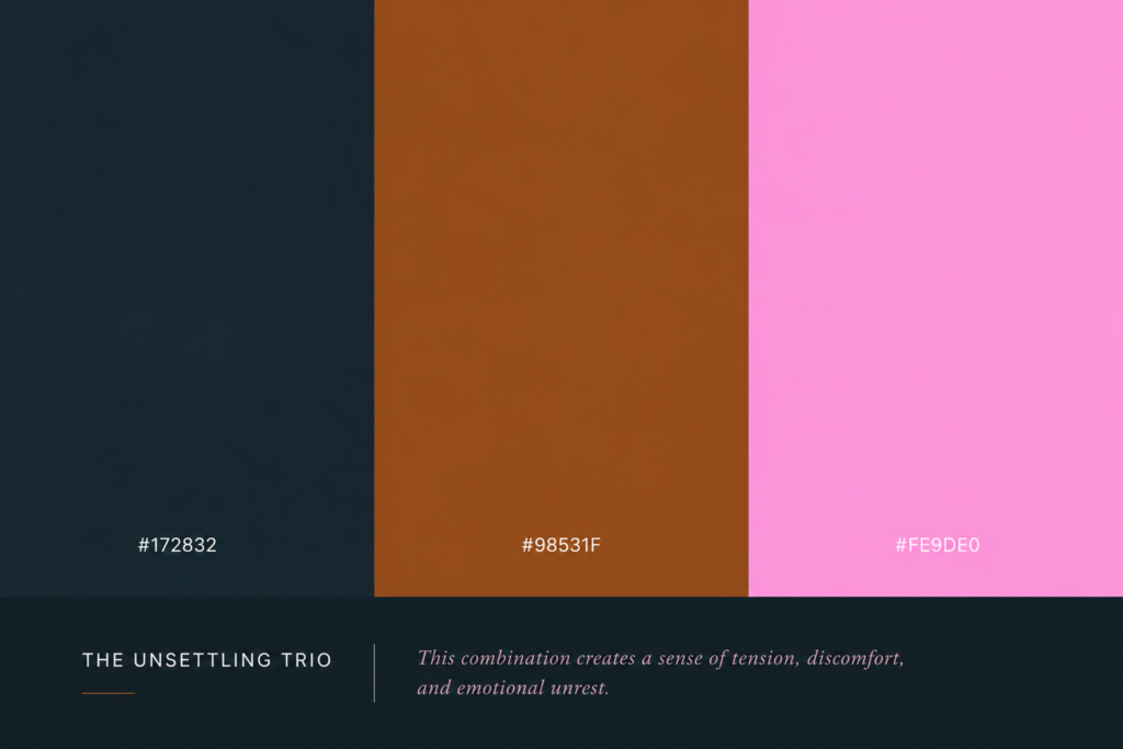
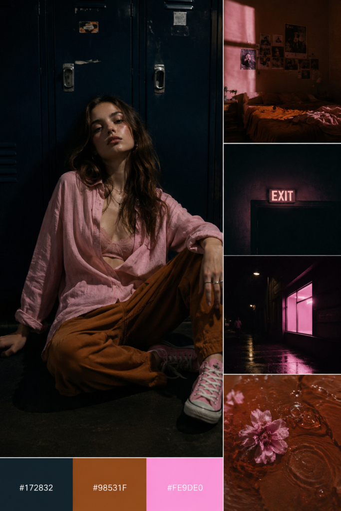
Deep blue, burnt brown, and soft pink come together to create a palette that feels tense, emotionally heavy, and quietly unsettling. It’s a striking example of how color psychology can shape the way we feel.
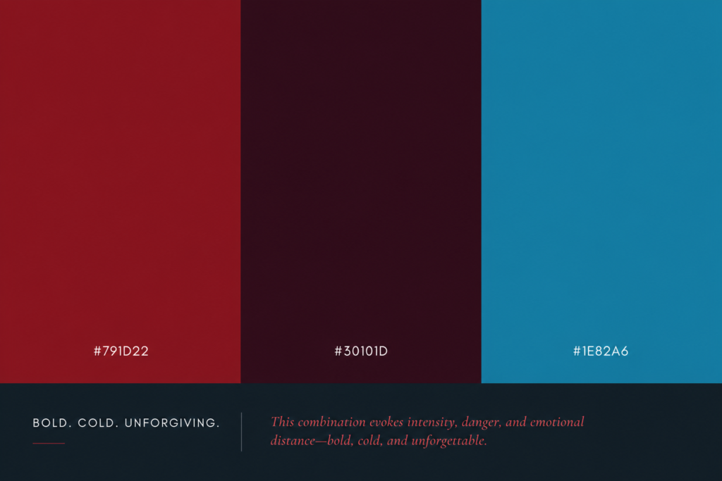
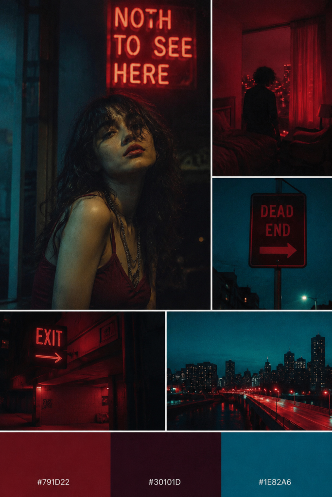
Bold crimson, deep burgundy, and icy cyan collide to create a palette filled with intensity and emotional distance. The striking contrast evokes danger, isolation, and quiet tension, making this combination feel powerful, cold, and impossible to ignore.
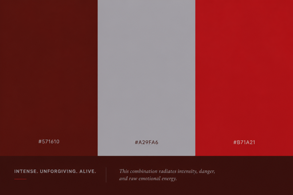
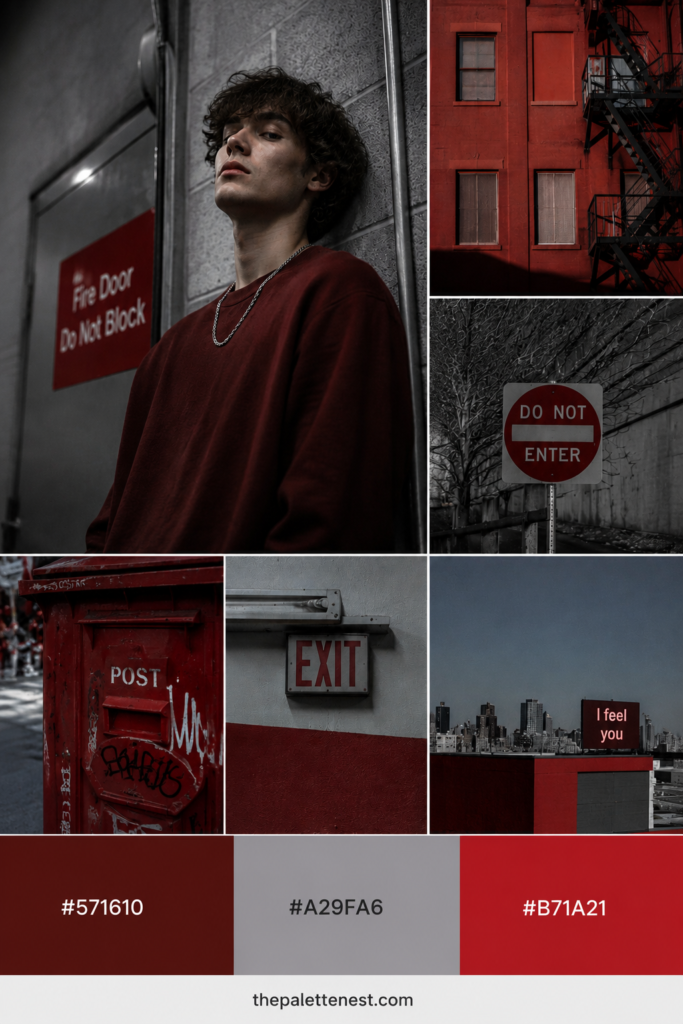
Deep oxblood, cold gray, and vivid crimson combine to create a palette charged with intensity and emotional conflict. The muted gray softens the brightness just enough to let the reds dominate, evoking danger, urgency, and raw emotional energy that feels both powerful and unsettling.
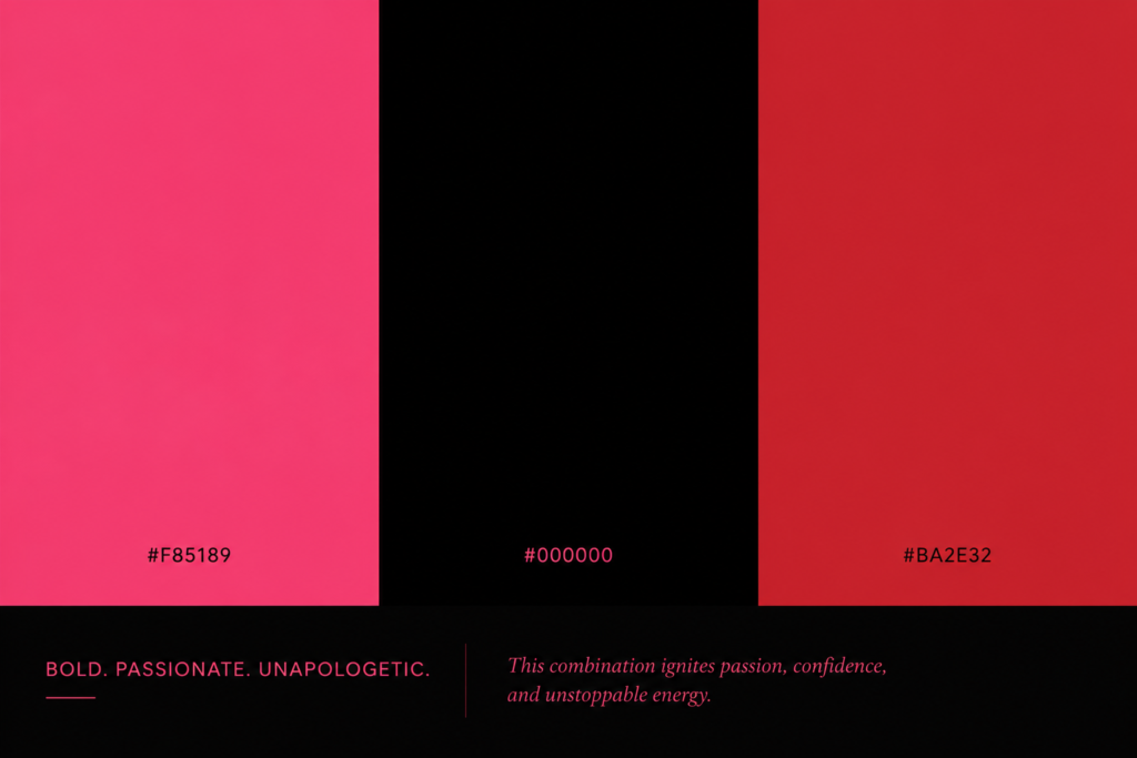
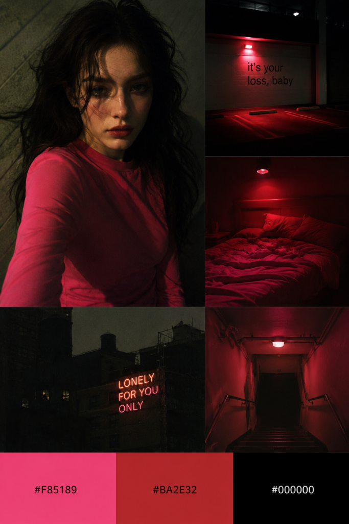
Vibrant pink, deep black, and bold red create a palette that radiates confidence, passion, and emotional intensity. The dramatic contrast feels fearless and unapologetic, evoking desire, power, and the kind of energy that commands attention while carrying a subtle sense of danger.
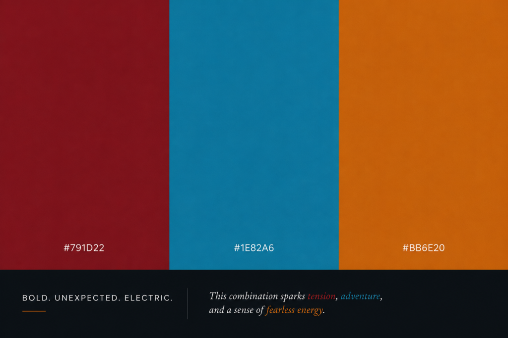
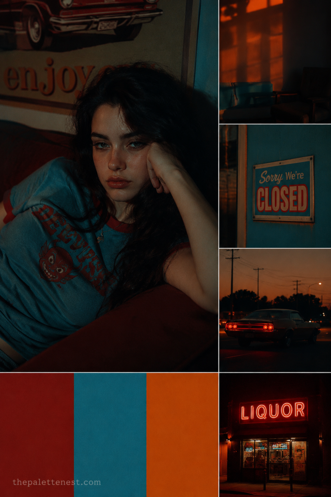
Rich crimson, electric blue, and warm amber create a bold palette built on unexpected contrast. The cool blue interrupts the warmth of the reds and orange, producing a striking mix of energy, conflict, and curiosity. The result is vibrant and expressive, yet carries an underlying sense of emotional tension that feels impossible to ignore.
Color isn’t just something we see—it’s something we feel. These five palettes show how unexpected combinations can evoke tension, mystery, confidence, and emotional depth. Whether you’re creating art, designing interiors, or simply exploring color psychology, these striking palettes prove that even the most uncomfortable colors can tell unforgettable stories.
Why do some color palettes feel uncomfortable?
Certain color combinations create psychological tension through strong contrast, unusual harmony, or emotional associations. Our brains often connect colors with experiences, making some palettes feel unsettling, heavy, or emotionally intense.
Can colors really affect emotions?
Yes. While personal experiences and cultural backgrounds play a role, research in color psychology suggests that colors can influence mood, perception, and emotional responses. The effect is strongest when multiple colors are combined thoughtfully.
Why do these color combinations still look beautiful?
Beauty and comfort aren’t always the same. Some palettes intentionally balance harmony with contrast, creating visual interest while evoking feelings such as mystery, tension, or melancholy.
Where can these color palettes be used?
These palettes work well for branding, editorial design, movie posters, fashion, photography, digital art, and interior concepts that aim to create dramatic or emotionally expressive atmospheres.
How can I use color psychology in my own designs?
Start by defining the emotion you want to communicate, then choose colors that reinforce that feeling. Dark tones can create depth, vibrant accents add energy, and unexpected contrasts often make a design more memorable.

Written By
PaletteNest editorial team creates home decor, color palette, and shop-the-look inspiration.
More to Explore
Looking for the best Fall Color Palettes 2026? Explore 10 gorgeous autumn color palettes paired with 40 stylish outfit ideas. Get inspired...
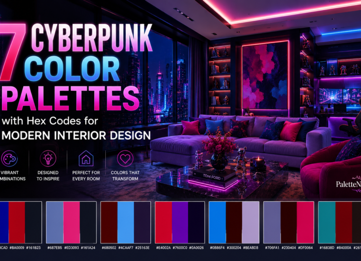
Explore 7 bold cyberpunk color palettes featuring vibrant neon hues, deep shadows, and striking contrasts. Each palette includes HEX codes and inspiration...